Every campaign post has a picture, and somebody is in it. A nurse. A pensioner. A crowd of students. A family at the kitchen table. The leader, grinning at a factory. Or nobody at all. Nobody votes on the pictures, but they quietly answer a question that the text often dodges: who is this party for?
Back in my PhD I hand-coded 1,208 Facebook posts from the Labour and Conservative pages and their leaders’ pages in the month before the 2015 and 2017 general elections. Every post, every image, every video, coded for who was in it. I have finally written up what those pictures say.
The paper is Who Gets to Be in the Picture? Political Identity Ownership on Labour and Conservative Facebook Pages at the 2015 and 2017 General Elections, free on Zenodo. The short version: the two parties swapped places.
The preprint
Open access, free to read, share and cite. 15 pages, 3 figures. Not peer reviewed. The counts behind every number are in the record too.
Cite as: Hotham, T. (2026). Who Gets to Be in the Picture? Political Identity Ownership on Labour and Conservative Facebook Pages at the 2015 and 2017 General Elections. Zenodo. https://doi.org/10.5281/zenodo.23279345
The idea: identity ownership
You may know issue ownership: parties try to make elections about the things they are trusted on, so Labour talks about the NHS and the Conservatives talk about the economy. Daniel Kreiss, Regina Lawrence and Shannon McGregor have a neat twist on this. They call it political identity ownership: parties also try to be seen as the natural home of particular kinds of people. Students. Pensioners. Nurses. Working families. You claim a group by showing its members, by standing your leader among them, and by talking about their worries.
Most of the work on this comes from the United States, and it is rarely measured. Facebook posts are a lovely way to measure it, because the pictures are right there.
Finding one: everyone talked to everyone
Neither party used its main Facebook pages to reach small groups. I had codes for Christianity, Islam, Hinduism, Sikhism and Judaism, for LGBT people and issues, for disabled people and issues, and for ethnic minority politicians. Across all 1,208 posts, those codes turned up in the pictures 39 times in total. No page pictured LGBT people or Judaism in a single image. Meanwhile, about 38% of posts pictured members of the public, and around one in ten pictured young people, older people or children.
So identity ownership on these pages was about big groups: the young, the old, workers, families, “ordinary people”. The narrower stuff, if it happened, happened somewhere else, such as targeted ads or satellite pages like Momentum.
Finding two: the great swap
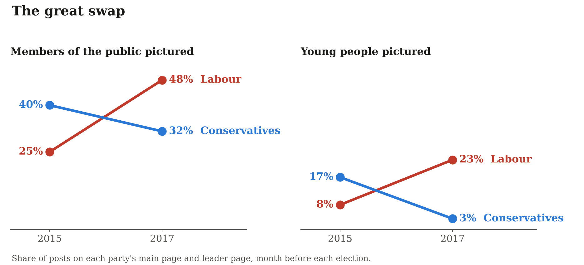
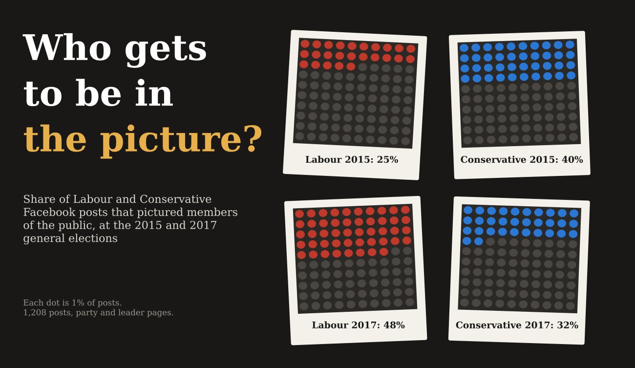
This is the bit that surprised me. You might expect Labour to always be the party that shows young people, nurses and ethnic minority Britons, and the Conservatives to show older voters. In 2015 it was the other way round. David Cameron’s Conservatives pictured members of the public in 40% of their posts; Ed Miliband’s Labour in 25%. The Conservatives pictured young people more than twice as often as Labour did (17% against 8%), and had smaller leads on older people, public-service workers and ethnic minority citizens. All the Hindu and Sikh imagery in my data comes from the 2015 Conservative pages. That fits a party that had spent a decade trying to look like modern Britain, and it is what Kreiss and colleagues call trespassing: showing groups that mostly vote for the other side.
Two years later it flipped. Jeremy Corbyn’s Labour pictured members of the public in 48% of posts and Theresa May’s Conservatives in 32%. Young people: Labour 23%, Conservatives 3%. The Conservative party page pictured young people in one post out of 95.
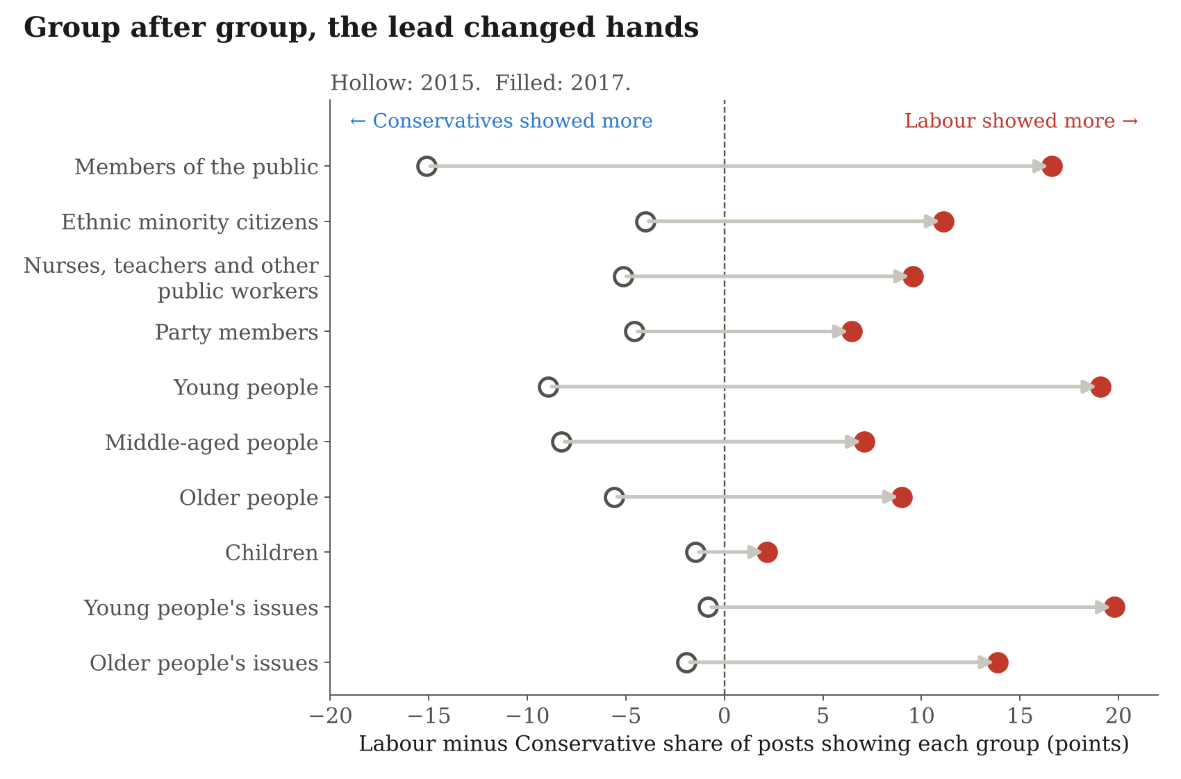
And it was not just one group. Party members, middle-aged and older people, nurses and teachers, ethnic minority citizens: on almost every one, the lead moved from the Conservatives to Labour. Labour also tied the people to their issues, raising young people’s issues in about a quarter of its 2017 posts and older people’s issues in about one in six, when in 2015 the two parties had been level on both. Children were the exception: both parties showed them in roughly one post in ten, at both elections. Everyone likes a child in a campaign photo.
This lines up with how people voted. Polling estimates put Labour’s lead among 18 to 24 year olds at 16 points in 2015 and 35 points in 2017. In 2017, each party’s pictures leaned towards its own voters. I cannot tell from this data whether the pictures won anyone over, or whether the parties simply showed the people they already expected to win. But the choice of whom to show changed sharply, in line with the very different campaigns the two parties ran.
Finding three: the leader and the flag
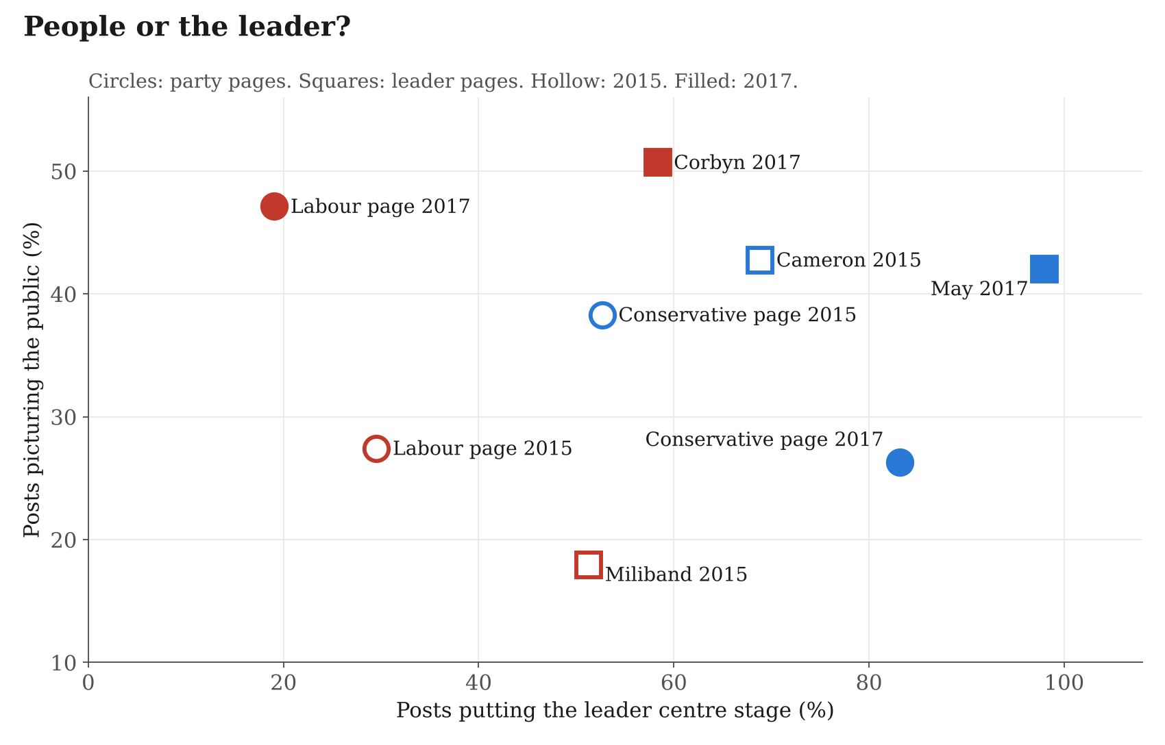
If the 2017 Conservative party page showed fewer people, what did it show? Theresa May. 88% of Conservative posts in 2017 put the leader at the centre, up from 60% under Cameron, and on May’s own page it was 98%. Labour stayed at about a third in both years. The Conservatives also reached for the nation: patriotic imagery was in 19% of their 2017 posts, against about 5% for Labour. Labour claimed groups of people (its slogan that year was literally “For the many, not the few”). The Conservatives claimed the country and the person who would negotiate for it. Both are identity work. They just point at different identities.
To be fair to the Conservatives, two things cut the other way. May’s own page still pictured the public in 42% of its posts, about as often as Cameron’s had. And in 2017 the Conservatives let ordinary people speak in their own words, quoting voters and testimony, just as often as Labour did, having almost never done so in 2015. That change is statistically as solid as some of Labour’s gains.
How sure am I?
The overall swap is solid: it shows up for nearly every group, and separately on the party pages and the leader pages. But there are only eight pages, and when I allow for the fact that pages differ from each other in ways I cannot measure, the evidence for most individual groups gets a lot weaker. The swap for members of the public and for young people survives that test. For the others I would trust the pattern more than any single number.
Other caveats: Labour’s 2017 party page posted almost only video, much of it infographics, which may show more people than photos do. My archive holds counts by page rather than post-by-post records, so I cannot link pictures to likes and shares. Ages and ethnicity are how people looked to a coder. And Facebook limited which posts tools like Netvizz could retrieve. All of this is in the paper.
Why it matters
We often treat a party’s identity as fixed: Labour is for this group, the Conservatives for that one. These Facebook pages suggest it is more like a costume a campaign chooses each time. It costs nothing to show a different set of faces, and in two years both main parties did exactly that. If you want to know who a campaign thinks it is for, look at who is in the pictures, and who has gone missing.
Read it
Hotham, T. (2026). Who Gets to Be in the Picture? Political Identity Ownership on Labour and Conservative Facebook Pages at the 2015 and 2017 General Elections. Preprint, Zenodo. https://doi.org/10.5281/zenodo.23279345
It builds on my PhD at the University of Bath on how parties use Facebook, my working paper on Momentum in 2017, and recent preprints on leaders, party pages and the polls, targeted ads in 2017 and 2019 and populist parties across Europe.
The views in this post and the paper are my own.

