
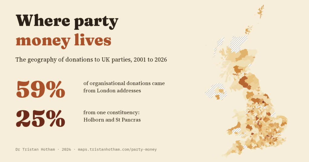
Since 2001, UK parties have had to report their larger donations, and when the donor is a company, a union or a club, the register gives its postcode. I put every one of those postcodes on a map. 59% of the money came from London addresses, and a quarter of it from a single constituency.
Every quarter, each registered party in the UK sends the Electoral Commission a list of the donations it has accepted above a threshold: who gave, how much, when, and which part of the party received it. The register goes back to February 2001 and is public. It has been read many times for who gives and how much. I wanted to ask a different question: where does the money come from?
There is a catch that shapes the whole study. The register publishes an address only for donors that are organisations. People who give have no postcode in it, so this is a map of money from companies, unions, clubs, associations, friendly societies and trusts. That is 40% of the money in all reported donations since 2001: £811m in today’s money, from 5,451 organisations. I never map or name individual donors.
A few addresses
I looked up every donor postcode and placed it in its 2024 constituency. London has 11.5% of the UK’s seats. It supplied 59% of the organisational money, more than five times its share. The rest of the map is pale by comparison: the median constituency’s organisations gave about £4,336 a year, and 40 constituencies had no organisational donor at all.
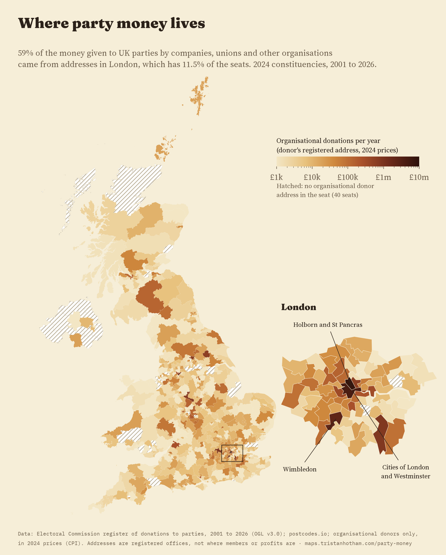
Zoom into London and it gets even more concentrated. One constituency, Holborn and St Pancras, supplied 25% of all the organisational money in the register, about £7.9m a year. That is because several of the biggest unions have their head offices there. The Cities of London and Westminster, mostly through firms with registered offices there, supplied another 14%, and Wimbledon, where two unions had head offices for much of the period, 7%. Just 4 constituencies account for half of the money.
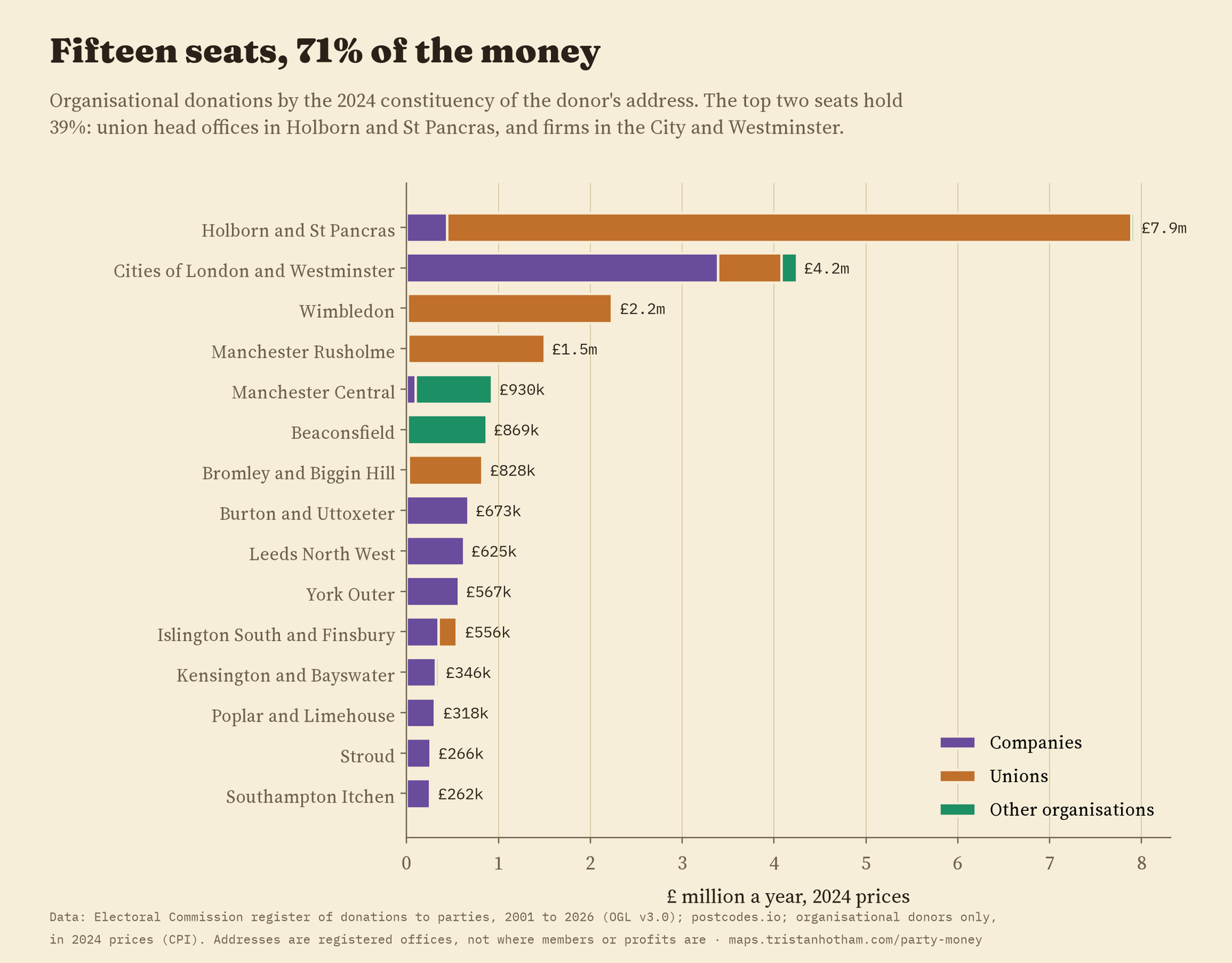
Outside London, the darker seats are usually one big donor: a manufacturer in Burton and Uttoxeter, a software firm in Leeds North West, a co-operative society in Manchester Central.
This is a map of where funding organisations keep their offices, not of where their members live or where their money is made.
That is the most important thing to know when reading the map. A union’s postcode is its head office. The money in its political fund comes from members all over the country. A company’s postcode is its registered office, which may be a city accountant’s address rather than the factory. So the map shows where the organisations that fund politics are based. It says nothing about where ordinary supporters live.
Unions and companies
Over the whole period, unions and companies gave almost exactly the same: £345m from 111 unions and £342m from 3,738 companies. Their maps could hardly be more different. 86% of union money came from London addresses, and the four largest unions gave 69% of all union money. Company money was spread much further: 46% from London. Part of that contrast is simply arithmetic: there are only 111 unions against 3,738 companies, and when I drew 111 organisations of either kind at random, their money looked almost as concentrated as the unions’.
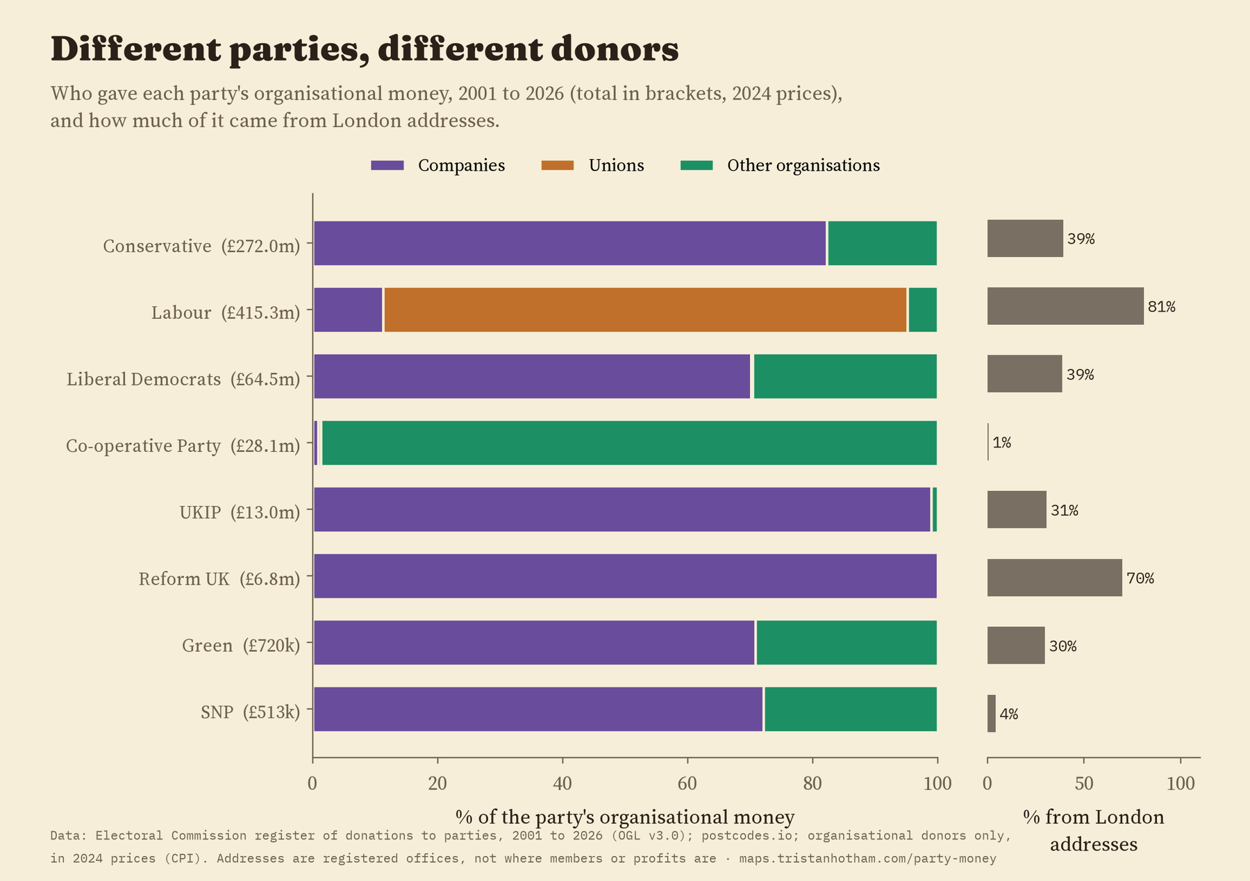
Different parties rely on different donors, so their maps differ too. Unions supplied 84% of Labour’s organisational money, so 81% of it came from London addresses. Companies supplied 82% of the Conservatives’ and 70% of the Liberal Democrats’, and 39% of each party’s came from London. The Co-operative Party’s money came almost entirely from co-operative societies outside London.
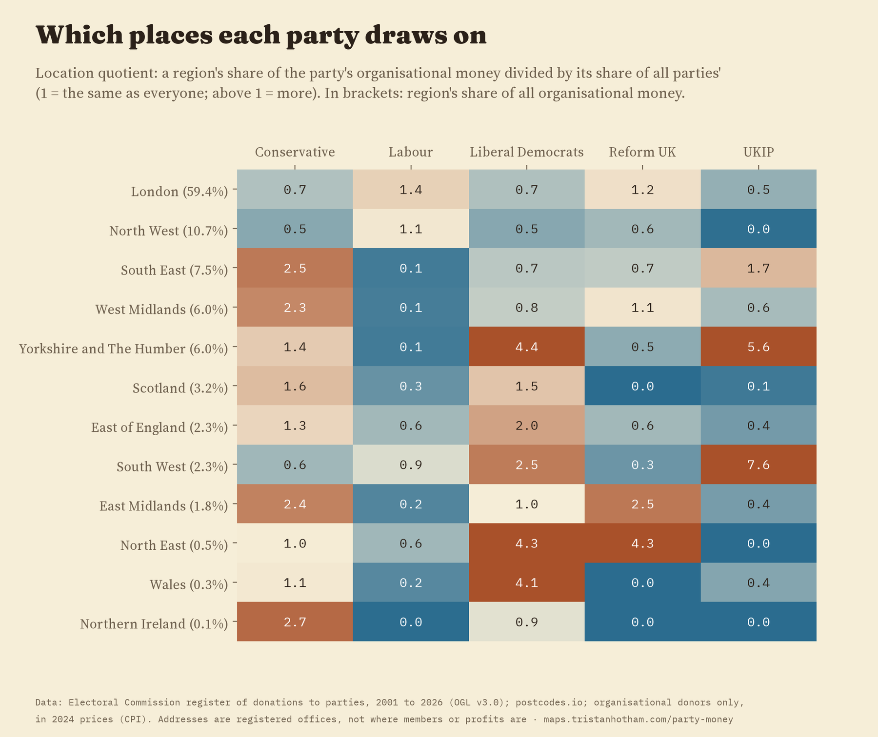
The parties also draw on different regions, well beyond what chance would produce. Compared with all parties together, Labour’s organisational money leans towards London and the North West, where its biggest union donors are based. The Conservatives’ leans towards the South East and the Midlands, and the Liberal Democrats’ towards Yorkshire, the South West, the North East and Wales.
How far does local money travel?
Most organisational money goes to the parties’ central offices. But 1,352 local parties that I could place on the map also received it, and here the question is how far the money travelled. Half of it came from within 12 km, and 59% from within 20 km. When I shuffled the local parties’ locations as a check, the typical distance jumped to around 197 km, so the closeness is not an artefact of how I placed them.
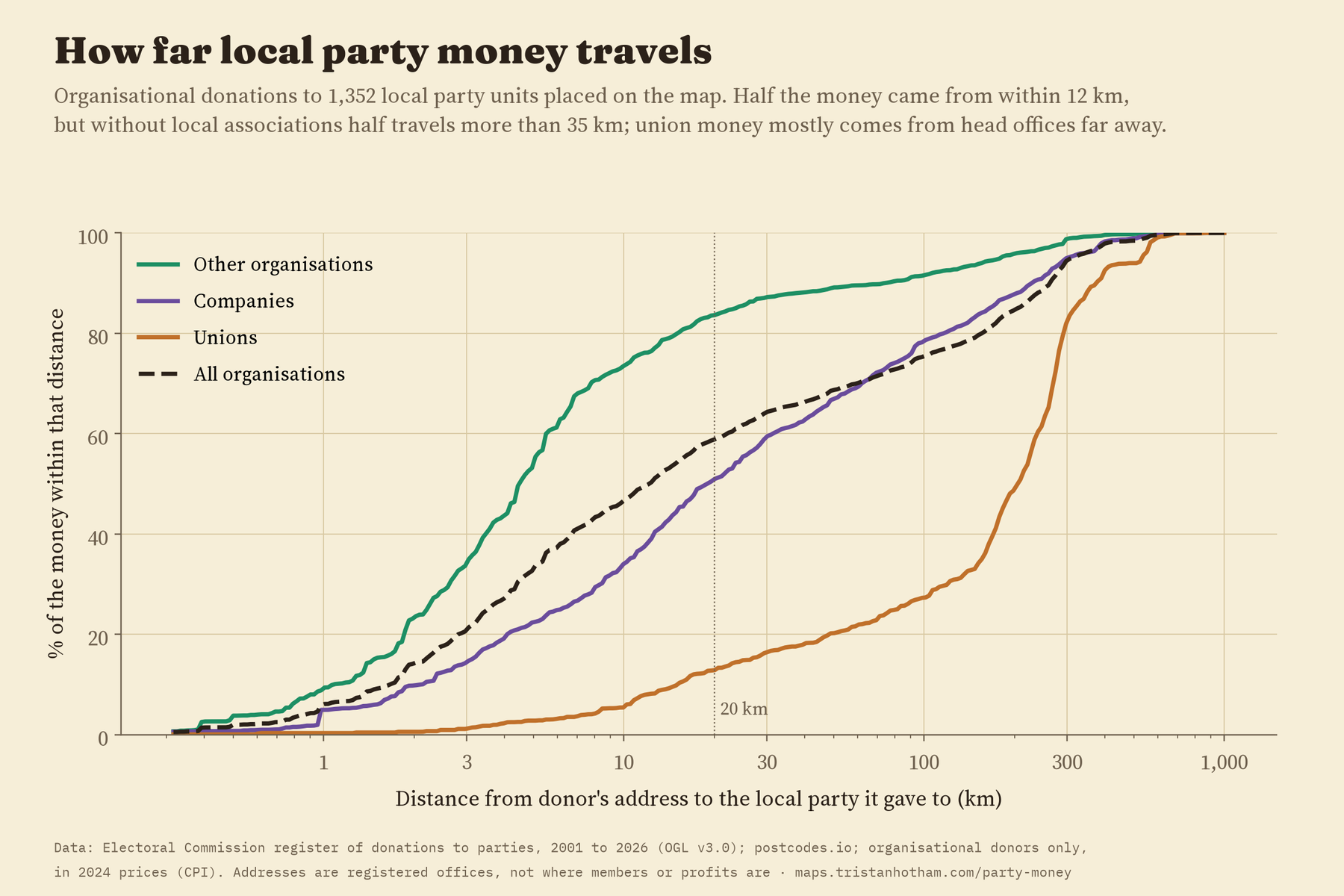
Who gives makes all the difference. Local associations, clubs and councillors’ groups gave from very close by: half within 4.5 km. Companies gave from a little further away, half within 19 km. Unions usually gave to local parties from their head offices, so half of their local money travelled more than 205 km. Take out the local associations and the typical distance rises to 35 km. So local party money is local mostly because of the local party world itself.
Has it changed?
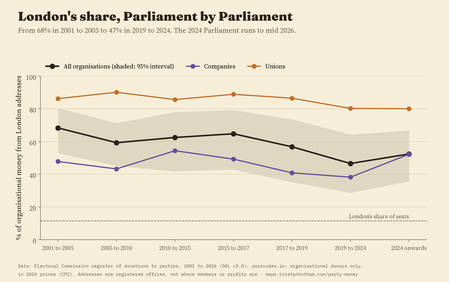
A little. London’s share was 68% in the 2001 to 2005 Parliament and 47% in 2019 to 2024. That trend is only just distinguishable from no change, because a few organisations matter so much, and it comes mostly from a changing mix of donors: within companies and within unions on their own there is no clear trend.
How I did this
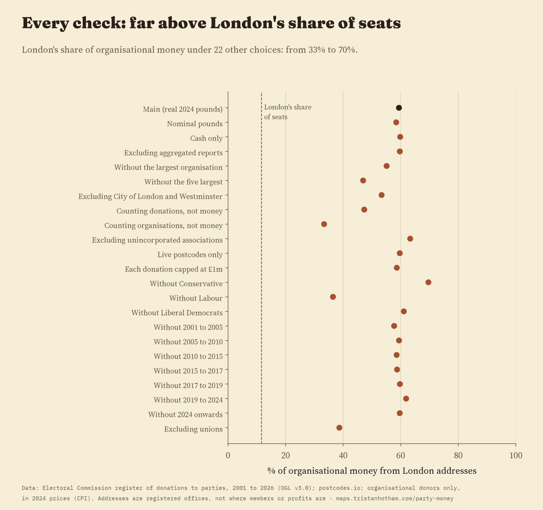
I used every accepted donation to a registered party in the Electoral Commission’s register from 2001 to 2026, leaving out returned and impermissible donations and public money such as parliamentary support for opposition parties. Values are in 2024 prices. Each organisation’s postcode was looked up with postcodes.io and placed in its 2024 constituency, and local parties were placed by their names. I wrote the analysis plan before computing any results and report every planned check, including the one about local money that did not hold up. London’s share stayed between 33% and 70% under 22 different choices, far above its share of seats every time.
What this can’t tell you: it leaves out donations from people, which are the biggest share of all, and anything below the reporting thresholds. It maps addresses of record, not where members, staff or profits are. And it describes where the money comes from, not what it buys.
Notes and sources
- Electoral Commission, Search the register of donations, retrieved 2026. Contains public sector information licensed under the Open Government Licence v3.0.
- Postcode lookups from postcodes.io (ONS and Ordnance Survey data, Open Government Licence v3.0). 2024 constituency boundaries from the ONS via voteReproject (Horan, Domijan and Brunsdon 2025). Prices: OECD consumer price index for the UK. Base map: OpenFreeMap, OpenStreetMap contributors (ODbL).
- Further reading: M. Pinto-Duschinsky, British Political Finance 1830 to 1980 (1981); K. D. Ewing, The Cost of Democracy (2007); R. Johnston and C. Pattie, Money and Electoral Politics (2014); J. G. Gimpel, F. E. Lee and J. Kaminski, The Political Geography of Campaign Contributions in American Politics (2006).
- I wrote the text, with drafting and editing assistance from Claude (Anthropic), which also helped prepare the analysis code. I reviewed and checked all text and results.

