
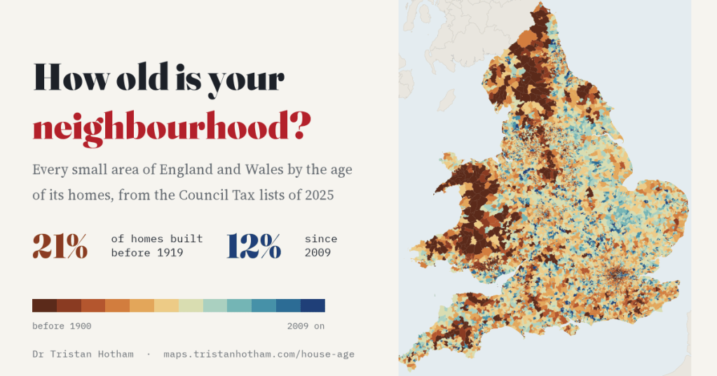
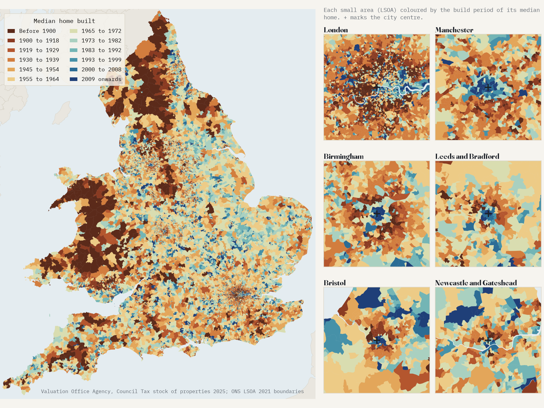
Every home in England and Wales has a build period on the Council Tax list. Put them on a map, small area by small area, and you can see the Victorian terraces, the semis of the 1930s, the estates of the 1960s and the flats of the last fifteen years. You can also see that cities grow like trees, in rings, until recently, when the newest homes started coming back to the middle.
How old is your street? Most of us have a rough idea: a terrace with a date stone, a 1930s semi with a bay window, a cul-de-sac that was fields when your parents were young. The Valuation Office Agency, which keeps the Council Tax lists, records a build period for almost every home in England and Wales. It publishes the counts for every lower layer super output area, small areas of about 760 homes each on average. There are 35,672 of them, and I have mapped them all.
A post-war country with a Victorian core
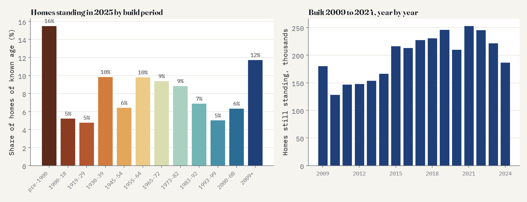
Of the 27.0 million homes with a known build period, 16% were built before 1900 and 21% before the end of the First World War. Between the wars came another 15%. The biggest slice is post-war: 26% were built between 1945 and 1972. Everything since 2009 adds up to 12%. The median home in England and Wales was built between 1955 and 1964.
Wales is older than England. 30% of Welsh homes predate 1919, against 20% in England. In England, London has the oldest stock of any region and the East of England the newest.
The oldest and the newest places
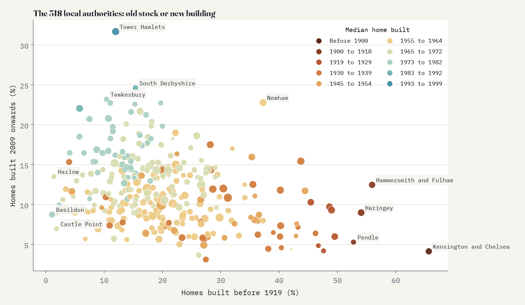
The council with the oldest homes is Kensington and Chelsea, where 66% were built before 1919. Next come Hammersmith and Fulham (56%), Haringey (54%) and, a long way from London, Pendle in Lancashire (53%). At the other end, in Basildon and Harlow, about one home in a hundred is that old.
The newest stock is in Tower Hamlets, where 32% of homes were built in 2009 or later, then South Derbyshire (25%) and Tewkesbury (23%). Newham is the odd one out: 37% of its homes are pre-1919 and 23% are brand new. In 1,032 small areas at least half the homes date from 2009 or later.
Cities grow in rings
Economists have long modelled cities as growing outwards in layers: each generation builds at the edge, the homes last, and the city ends up like a tree trunk with its oldest rings in the middle. Is that what English and Welsh cities look like? I took the 34 cities with at least 100,000 people, measured the distance from each small area to the nearest city centre, and asked where the homes of each era stand. I wrote down the tests before measuring any distances.
The rings are real. From before 1900 to the late 1960s, each era’s homes stand on average 4.3% farther from the centre than the era before, and the order holds in 33 of the 34 cities. The interwar semis sit in a ring between the Victorian streets and the post-war estates in 32 of the 34. To check that this is about city centres and not just about how building is spread around the country, I moved every centre 10 km in a random direction and ran the test again, 200 times. Not one of the fake centres came close.
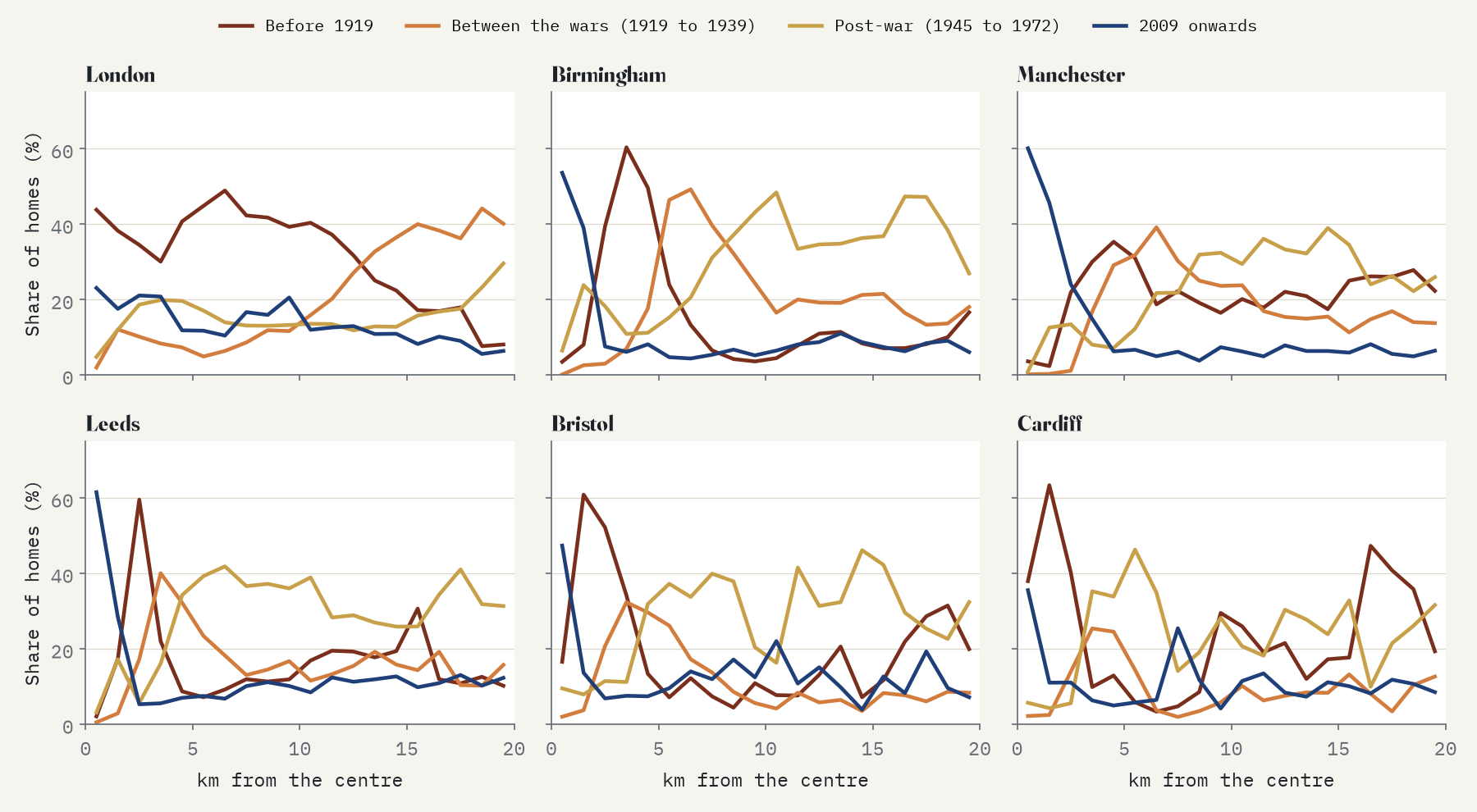
Within a kilometre of the 34 city centres, 32% of homes were built in 2009 or later.
Then the new homes came back in
The outward march stopped in the 1990s. Homes built from 1993 to 1999 stand farther out than those of any other era. After that, the direction flips. Homes built since 2009 stand on average 9% closer to the centre than homes built from 1983 to 1999, and they do so in 26 of the 34 cities. The change is biggest in Manchester, where the newest homes stand 35% closer in.
The centres themselves have changed most. Within 1 km of the 34 centres, 32% of homes were built in 2009 or later and another 15% between 2000 and 2008, and 79% of all homes there are flats. The oldest ring now starts just outside: between 1 and 2 km from the centre, 40% of homes predate 1919.
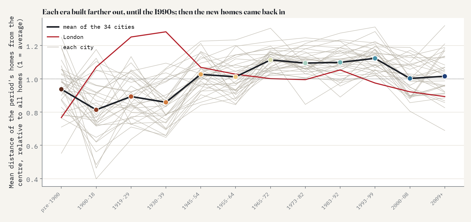
One of my tests failed, and it is worth saying so. I had also expected the average build year to rise steadily with distance from the centre. It does rise, by 0.6 years per km, but the fake centres produced slopes as steep in 8.5% of tries, so by the rule I set in advance that simple gradient is not evidence of anything. The reason is the pattern above: the middle of the city is now young, the oldest homes are a ring further out, and a single straight line cannot describe that.
Old homes, high bands
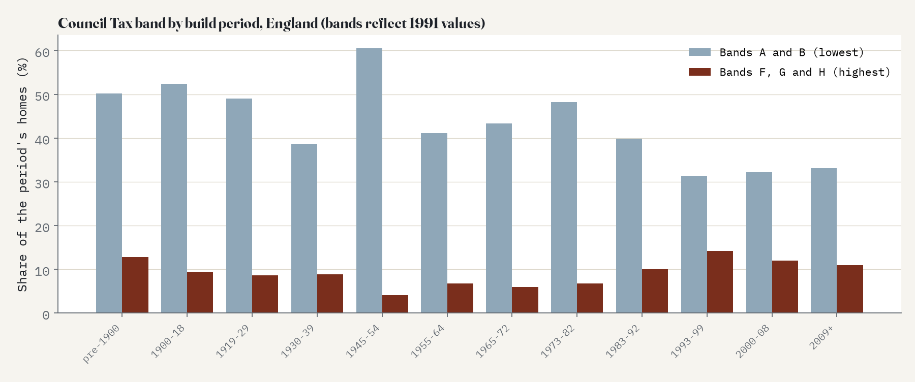
Old homes are mostly terraces and flats. Where the typical home predates 1919, 43% of homes are terraced houses; where it is interwar, 33% are semis; where it is from 2009 or later, 51% are flats. In England, homes built before 1900 are split: 50% are in the two lowest Council Tax bands but 13% are in the top three, against 4% of homes built between 1945 and 1954.
How I did this
The data are the Valuation Office Agency’s Council Tax stock of properties at 31 March 2025, tables CTSOP4.1 (build period and band) and CTSOP3.1 (property type and band), for every small area of 2021. Counts are rounded to the nearest 10 and counts under five are hidden; I count those as zero, and counting them as 2.5 changes nothing that matters. There is no build period code for 1940 to 1944, and 0.7% of homes have none at all. The 34 cities are the places in England and Wales with at least 100,000 people in Natural Earth, centred on their Wikidata points, and every small area within 20 km belongs to the nearest centre.
The analysis was pre-specified in a written plan before any distances were computed. The rings and the return to the centre hold with smaller and larger circles, with different centre points, leaving out each region in turn and leaving out London, and the rings also hold at a coarser scale.
What this cannot tell you: these are the homes standing today. Homes that were demolished are missing and conversions can turn one house into several flats, so an area’s profile is what survived, not what was built. The build period is an administrative code, coarse before 1900. And measuring distance from one centre is a simplification for places with several, like the West Midlands or West Yorkshire.
Notes and sources
- Valuation Office Agency (2025) Council Tax: stock of properties, 2025, tables CTSOP3.1 and CTSOP4.1. Official Statistics, Open Government Licence v3.0.
- Office for National Statistics, Lower layer Super Output Areas (December 2021) boundaries, Open Government Licence v3.0, via the GitHub copy in drkane/geo-lookups.
- City list: Natural Earth (public domain); city centres and place names: Wikidata (CC0). Base map: OpenFreeMap and OpenStreetMap contributors (ODbL).
- Background: Brueckner and Rosenthal (2009) Gentrification and neighborhood housing cycles, Review of Economics and Statistics; Brueckner (1980) A vintage model of urban growth, Journal of Urban Economics; Wheaton (1982) Urban spatial development with durable but replaceable capital, Journal of Urban Economics.
- Hotham, T. (2026) How old is your neighbourhood? Zenodo. https://doi.org/10.5281/zenodo.24113860
- I wrote the text, with drafting and editing assistance from Claude (Anthropic), which also helped prepare the analysis code. I reviewed and checked all text and results.

