
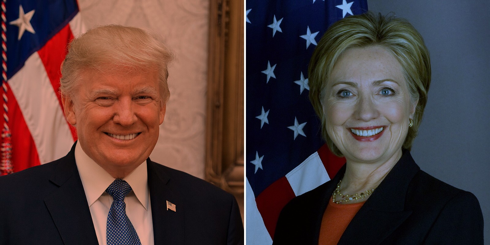
Counties that watched more Trump on YouTube in 2016 voted more Republican. That is not news. The useful question is what the watching tells you that you did not already know.
I have a record of YouTube views of Trump and Clinton content, county by county and day by day, from 1 January to 15 October 2016. I have now written it up as a preprint, with a lot of checks, because a result like this is easy to over-sell.
The preprint
Open access, free to read, share and cite. 14 pages, 6 figures, full methods and robustness checks.
Cite as: Hotham, T. (2026). Did YouTube Attention Predict How Counties Voted in 2016? Zenodo. https://doi.org/10.5281/zenodo.23261574
The short version
Most of the link is geography
Compare counties in the same state and the Trump share of views looks powerful: 10 more points goes with a 6.4 point higher Republican vote. Then I held demographics fixed, and it fell to 2.8. Then I held the 2012 vote fixed, and it fell to 0.5. A place’s past explains almost everything.
Figure 1. Where the link went
6.40 Counties in the same state, nothing else held equal
2.84 …and demographics held equal
0.53 …and the 2012 vote held equal
What is left is small, and real
The leftover is the 2012 to 2016 swing. Inside a state, with everything held equal, a county with 10 more points of Trump share swung 0.53 points more to the Republicans (95% confidence interval 0.33 to 0.74). It survives dropping the national spike days, weighting by votes, dropping any one state, and allowing for spatial clustering. The same measure does not predict the 2008 to 2012 swing, which it could not have caused.
It also gets smaller the closer you look. Compare near neighbours in the same state and the number is 0.23. Compare neighbours across a state line, holding each border fixed, and it is 0.33 to 0.40. The view share is noisy, and noise hits close comparisons hardest: correct for it and the baseline rises to about 0.6. So it is a local signal, and a modest one.
Figure 2. The closer the comparison, the smaller the link
0.53 Counties in the same state
0.33 to 0.40 Neighbours across a state line, border held fixed
0.23 Neighbours in the same state, within 50 km
0.14 Placebo: the 2008 to 2012 swing, largest estimate (not significant)
Who actually moved
The swing was not a surge of new Republican voters. Per 10 points of Trump view share, Republican votes rose 0.8% more and Democratic votes fell 1.7% more, while total votes did not change. It was mostly Democratic votes going missing.
Figure 3. It was lost Democrats, not new Republicans
-1.7% Democratic votes
+0.8% Republican votes
-0.2% Total votes (not significant)
It looks like orientation, not persuasion
Attention measured in the primaries, before Trump was formally nominated, predicts the swing about half as strongly as attention in the general election. Places that were drawn to him early were the places that moved. That fits a county that was already heading his way better than a county that was talked round by videos. The measure also does not help forecasting: for counties in states the model has not seen, adding YouTube leaves the fit unchanged.
The audience was a signpost, not a steering wheel.
What I am not claiming
- Not that YouTube moved votes. Nothing here is causal, and a share of views is attention, not support. Plenty of people watch the candidate they dislike.
- Not that counties are voters. These are place-level patterns.
- Not a forecasting tool. It adds nothing across states.
- Not settled. I do not know exactly how the YouTube data were built, the share is strongly clustered by state, and it is one election. The paper says what a better design would need.
This follows my earlier preprints on Britain First’s Facebook page and on the Leave and Remain campaigns on Facebook. Same habit: test the story people tell about digital attention, and report how much of it holds up.
The views in this post and the paper are my own.

