

The popular story is that Leave won on Facebook by being louder, angrier and more negative. I tested it on 17,657 posts from 92 UK pages. Leave pages drew most of the engagement. They were not more negative.
I collected Facebook post data from the official and unofficial referendum campaigns and from the main UK party, leader and MP pages during and after my doctoral research at Bath. This preprint covers the window from 20 February 2016, when the referendum was announced, to polling day on 23 June. It builds on my earlier paper on Britain First’s page and on my thesis on how parties use Facebook.
The preprint
Open access, free to read, share and cite. 22 pages with full methods, a validation of the text coding, and robustness checks. Not peer reviewed.
Updated 9 October 2026: version 2 corrects the description of the validation sample (coded by an AI model, not by hand), the claim about the size of the engagement premium on each side, and several descriptive statements. No estimate changed.
Cite as: Hotham, T. (2026). Who Won the Facebook Referendum? Engagement, Tone and Nationalism on UK Party and Campaign Pages, February to June 2016. Zenodo. https://doi.org/10.5281/zenodo.23262531
Leave got most of the engagement, from a minority of the posts
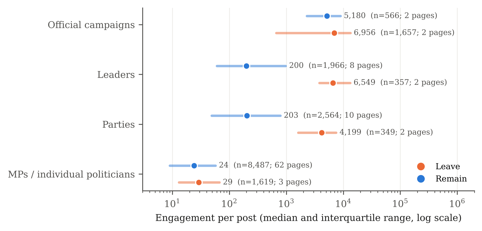
Leave-aligned pages produced 65% of the 33.5 million interactions in the data, from 23% of the posts. Most of the lead comes from four large pages (Leave.EU, Vote Leave, Farage and UKIP), and it shrinks but stays positive, with wide uncertainty, when audience size is held constant. Per post the picture is mixed. Stronger In earned a median of 7,480 interactions, well above Vote Leave (2,844) and below Leave.EU (9,324). The official Leave campaign’s page did less well per post than the official Remain campaign’s, and it was the unofficial Leave.EU page that did most to give the Leave side its lead.
Figure 1. The three campaign pages
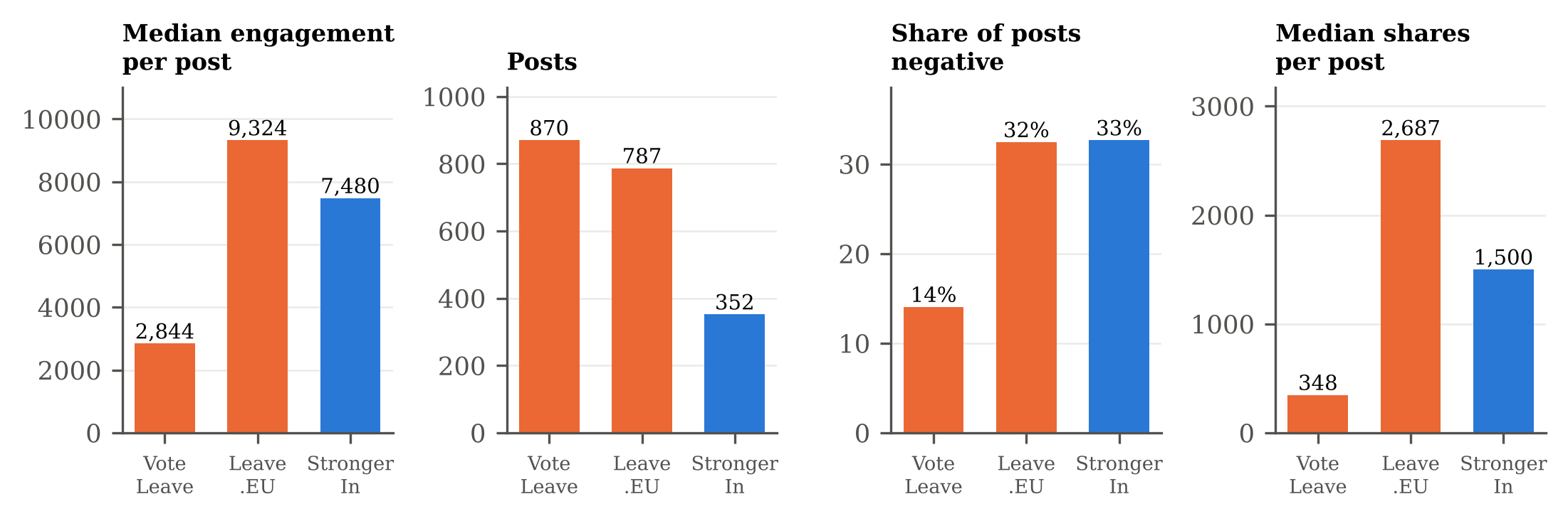
Figure 2. Engagement by side and tier
Leave was not more negative
The tone result is the one that took the most care. I measured negativity with a dictionary-based method, then checked it against a validation sample of 360 posts coded by an AI model (Claude) working from a written codebook. The check changed the numbers. The dictionary is precise but misses about 42% of the negative posts, so it understated how negative everyone was.
Corrected for that, 37% of Leave posts and 42% of Remain posts were negative when comparing campaigns, leaders and parties like for like. The difference of 5 points has an interval (95% CI −19 to +8) that comfortably includes zero.
Across all pages Leave does look more negative, at 48% against 28%. That gap comes from one account: Douglas Carswell’s MP page supplies 96% of the Leave MP posts, and in the validation sample 62% of the 48 Carswell posts were negative, against 20% of the 55 Remain MP posts. The claim that Leave was more negative is a claim about particular pages, and it can be produced or lost by choosing which pages to compare.
Among the three campaign pages, Vote Leave was the least negative. Leave.EU and Stronger In both sat high, and Stronger In used more risk and threat language than either Leave page, which fits the “Project Fear” label. Leave was less positive and more neutral, not more hostile.
Negativity paid on both sides
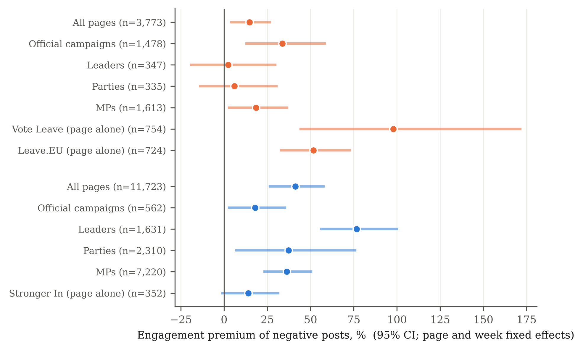
Negative posts earned 15% more engagement on Leave pages and 41% more on Remain pages than other posts by the same page in the same week, in models fitted to each side separately. Which side gets the bigger premium depends on the specification: with common controls Leave’s premium is the larger (50% against 30% across all pages), and neither difference is distinguishable from zero once inference is done at the page level. I do not claim a difference either way. The premium was largest on Vote Leave and Leave.EU, but Vote Leave posted so little negative content that it cannot explain a lead.
Figure 3. The engagement premium of negative posts
What the two sides talked about was different
Leave pages posted far more about immigration (17% of posts against 5%) and about British identity, sovereignty and control (23% against 6%). Remain pages posted more about the economy (29% against 22%) and about cooperation, though cooperation was rare on both sides (10% against 4%). On Leave pages the audience rewarded the Leave side’s own themes and its calls to action, which is a different mechanism from the negativity story.
Figure 4. What the two sides talked about
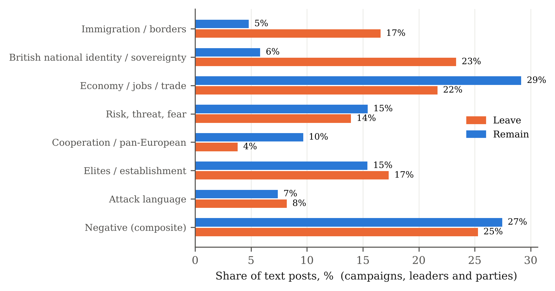
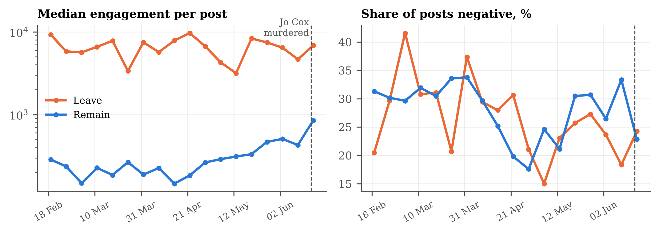
Figure 5. Engagement and negativity through the campaign
The caveats matter
The data are not a clean experiment. There is one official Remain page against two Leave campaign pages, and dozens of small SNP MP pages on the Remain side. I match comparisons by tier, bootstrap by page, and say where the number of Leave pages is too small to conclude anything. The Leave all-pages premium rests on nine pages, and a wild cluster bootstrap gives p = .14. Many party pages were also fighting the 5 May elections: Remain-side party pages mentioned the EU in 9% of their posts before that date and 52% after, so some of what I measure is election campaigning. I identified the Stronger In page from its content. The validation sample was coded by an AI model working from a written codebook, not by a pair of human coders, so the agreement figures are not inter-coder reliability, and a human second coder is the obvious next step. The text coding cannot see images. And engagement is not persuasion: I make no claim about what moved votes.
Leave pages took most of the engagement, driven by a few very large pages. Nothing here shows it won that attention by being more negative than Remain.
Negative posts drew more engagement on both sides, as they did on Britain First’s page. The coded post-level dataset, without message text, is available on request.
The views in this post and the paper are my own.

